With the price of energy on a relentless climb, more and more people are struggling with their energy bills. Yesterday a survey came out that suggested that 28% of Britons would consider moving to a smaller house to lower their energy costs.
That may be a little drastic, especially when you consider how many people haven’t bothered to insulate properly yet, but it does illustrate how serious the problem is. 5.5 million people in the UK are living with energy poverty, and that number will continue to rise.
Understanding the cost of energy is important, and generally speaking we’re not very good at it. Drivers know the price of a litre of petrol, and it’s a recurring topic of conversation. Since we pay our bills quarterly and often by direct debit, the price of electricity of gas is much discussed.
So today I just wanted to plug iMeasure again. I’ve mentioned it before, but I’m recommending it again because it recently upgraded the site and there are a host of new features and tools.
Sign up, and you’ll be reminded each week to read your meters. This isn’t particularly onerous. It takes thirty seconds, and I do it on a Sunday evening as I put out the dustbins, as part of a weekly habit. Enter the data into the site, and you can track your energy use over time. Each week you can see if it’s been an energy intensive week or not, and think about why. It’s been the single most useful thing I’ve done in reducing my own energy use, and with it my carbon footprint and my household bills.
One new feature is a weather analysis tool. Energy use is one thing, but it doesn’t tell you much about efficiency. To see whether your house is performing well, you need to be able to compare energy use against the weather outside. That’s now possible. You can graph your house against the temperature record of a nearby weather station, and see not just how much energy you’re using, but how well you’re using it.
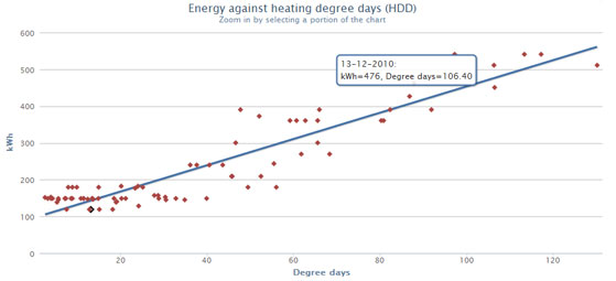
If you’ll excuse a bit of energy geekery, this is my household performance measured against Heating Degree Days (HDD). Briefly, HDDs are calculated by taking a base temperature that a house should maintain – say 15.5C. If a day is colder than that temperature, the heating will need to be on. By subtracting the temperature from the base temperature, you get a general measure of heating demand. When that heating demand is graphed against energy used, you get a measure of efficiency.
In the graph above, each of the dots is a weekly meter reading for my house. The ones clustered around the lower left are the summer readings, the ones off towards the upper right are the really cold weeks. The more efficient a house, the more uniform those dots will be. If your house was 100% efficient, it would track the line exactly.
Correlation between outside temperature and energy use can be summarised into a single figure of efficiency, between 0 and 1. The UK average is 0.87, and the closer you get to 1 the better. My house comes in at 0.93, which is well above average but a way off the 0.97 that is considered excellent.

