
In order to reduce global greenhouse gas emissions, we need to know where they occur. The richer our understanding of emissions, the more targeted we can be in our actions. We can identify the biggest sources and prioritise.
That’s easier said than done, because working out carbon footprints can be complicated. It’s especially difficult to calculate the climate impact of complex and dynamic things, such as cities or transport infrastructure. There may not be any single body responsible for them, no central data sources, and not everyone can afford the statisticians to compile them.
One way around this is to gather climate data remotely instead, using sensors and satellites. Climate TRACE is a major project that has taken on this challenge and just reported its first inventory of global emissions this month.
Climate TRACE observe emissions sources with satellites and process them with AI. Where emissions have been calculated already, they feed that into the system to ‘ground truth’ their estimates and refine the algorithms. Through machine learning, they can over time identify sources of emissions from space and quantify them. They are now tracking 660 million sources of greenhouse gases, from obvious targets such as power plants to less commonly quantified things such as rice fields.
All of this is available to browse online, free of charge, thanks to the not-for-profit coalition of universities behind the project. For many regions, it’s the first time they’ll have had access to any kind of carbon calculation – apparently 80% of cities around the world didn’t have an inventory of greenhouse gases until Climate TRACE published its figures two weeks ago.
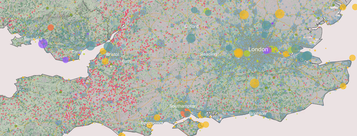
Have a browse of the map and you’ll see how this works. This snapshot of the south of England is a good example of how it can highlight high-carbon sources to focus on. Take a look at that five-pointed star of yellow dots around London: that’s four airports and Tilbury docks. The top left point of the star is the airport in Luton, a mile from my house. The purple dots in the city itself are the Tate and Lyle sugar plants, and there are a number of big emissions sources along the Thames, reflecting the river’s role as a historic transport corridor for industry. We can see more shipping infrastructure on the south coast, and the rash of little red dots out west are mainly dairy farms.
You can do a similar exercise anywhere on the globe, and it will get better over time. Have a look, and see what you can learn about your own part of the world.

Thank you for this post, and the link. It loads efficiently and is fascinating!