
One of the confusing things about climate change is the conversation around carbon. For starters, greenhouse gases, carbon and carbon dioxide are all talked about interchangeably, though they are different things. Then you get carbon footprints, which is a funny way of expressing a quantity of gas, especially since we then measure that footprint in tonnes. It’s a mess, a complete jumble of metaphors.
That makes it hard to understand, and if we don’t understand greenhouse emissions they can seem academic and theoretical. If we had some better ways of talking about climate gases, perhaps it would be easier to take responsibility for them. Since we’re referring to gas, perhaps we should talk bubbles, or balloons. That makes more sense, and is much easier to visualise.
That’s one of the insights behind Carbon Visuals, a team that develops graphics and videos that portray carbon emissions in easy to understand visual forms.
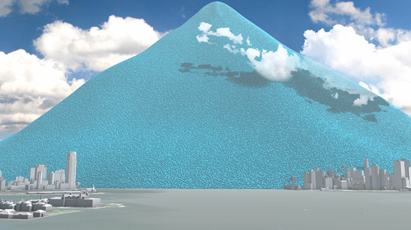
One tonne of CO2, that’s a sphere about 10m across:

The average British adult is responsible for about ten of those bubbles a year. New York City generates 54 million tonnes of CO2 a year. If you were to stack 54 million bubbles like this on New York, it would look like this. (You can watch this visualisation as a video here)
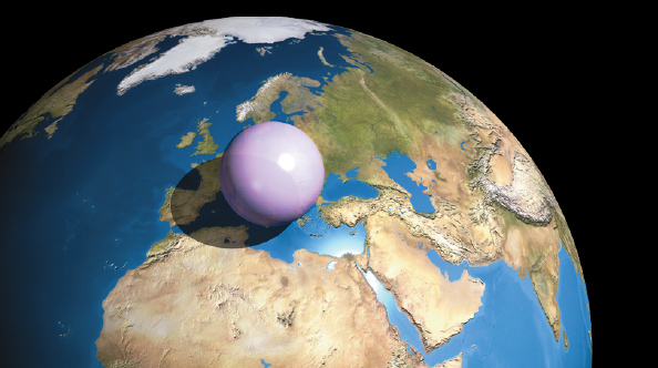
For some people, one of the biggest obstacles is the size of the earth – can human activity really influence an entire planet? Surely our carbon just vanishes into the enormity of the sky. But how big is the atmosphere? Not all that big, relatively speaking. It’s a very thin layer around the earth, thinner than the skin on an apple if you were to reduce the planet to that size. Draw together all the air in the atmosphere into one ball at sea level density, and it would be this big:
For more ways to view carbon, visit the Carbon Visuals website. Educators may be interested in the downloadable poster.
