
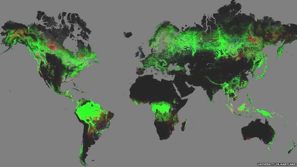
The image above shows the world’s forests, and the losses and gains between 2000 and 2012. It’s been stitched together in Google Maps using 654,178 satellite images. The red patches are forest lost during that time, and blue shows new forest. You can zoom in for a quite remarkable level of detail.
There’s more red than blue, with a net loss of forest cover the size of Mongolia. It includes widespread deforestation in Indonesia, and land clearance for agriculture in Brazil and Bolivia. Not everything is man-made though. The striking triangle bitten out of the French coast was the work of Cyclone Klaus in 2009, which whipped out of the Bay of Biscay and flattened the pine forests of the Aquitaine. The map also shows extensive forest fire damage in the Russian east.
It’s the first time that this global perspective has been available, thanks to a project at the University of Maryland. The data on forest change is the point here, and the accountability that comes from making the information available, but it’s worth mentioning the technology too. We’re not easily impressed in the internet age, but consider what it would have taken to create a global survey of the world’s forests before the availability of satellite imagery. Imagine the enormous pile of physical maps you’d have needed to navigate to find anything. What we have here is an extraordinary information power tool that previous generations of foresters and environmentalists would have killed for. And here it is, free and sitting there on the internet for the likes of you and I to click about on for five minutes on a Monday afternoon. We’re kind of spoilt, aren’t we, when you think about it?
UPDATE: My friend Bryan from Wildlife Works points out a problem with the project that I ought to mention. In processing the satellite imagery, the computer is instructed to look for green forest cover. That’s fine for most parts of the world, but some areas have dryland forests that won’t come up green. Those are some of the world’s most vulnerable forests, and they risk being overlooked on the map. It’s still a really useful project, but it’s not exhaustive and ought to be considered a quick guide to global forest change rather than the final word.

Stunning. Fascinating. Moving.
I bet you did what I did and zoomed in on Madagascar!
I think all sorts of data (including global forest cover) should be entered into a kind of meta-database showing all natural capital, and made freely available on the internet for anyone to access. It would be a huge challenge but I think it could really help to inform policy and would be invaluable as an educationary tool, or for journalists to use.
Yes, you could add categories for fish stocks, fresh water, air quality and all sorts. The data exists, it just hasn’t been digitised and made as interactive as this is. Hopefully someone is working on such a thing as we speak…
I am quite intrigued by this map, which shows when enlarged a blue region in western Victoria, Australia. I believe that this is due to new commercial eucalyptus plantations. These are just reaching logging stage and there has been a lot of noise in the media because koalas have moved into those forests and multiplied. Now the question is how can you fall a tree without injuring a koala?
Interesting. I’m sure there are lots of incidences of blue on the map that are commercial plantings. There’s lots of pink on the map too when you zoom in, which shows places that have seen loss and gain, and as the map is updated I suspect western Victoria will end up pink too. As for the koalas, I’m not sure what you do about that.
Love maps like these, so stunning and so interesting.