
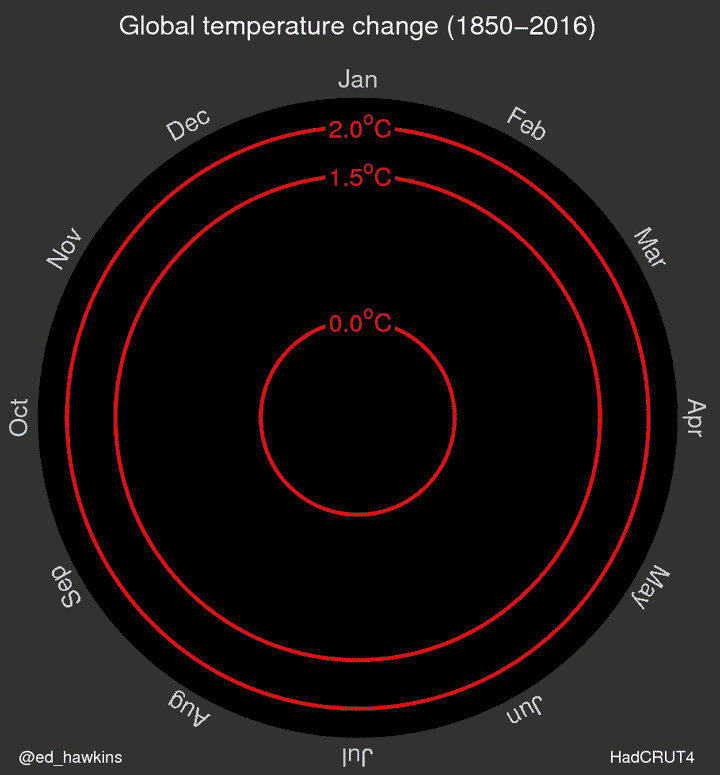
If you’ve been following climate change news, you’ll have heard that we’re on a record breaking streak. January, February, March and now April have all been the hottest yet, boosted by a strong El Nino this year. 2016 is almost certainly going to be the warmest year on record.
If you’ve heard all of that, then you’ll have seen this graphic already. But for those who haven’t, climate scientist Ed Hawkins has mapped the warming in a striking graphic, showing each month’s data point from 1850 to this year. It’s as simple a demonstration of the warming trend as you’re going to see anywhere. Perhaps most importantly, it shows how close we are skirting to 1.5 degrees.
If the graphic below doesn’t work for you, try the original at Climate Lab Book here.

Obviously Sweden is not one of the parts of the globe that has been affected by this warming. The sea was about eight degrees at the start of the week. Too damned cold to stay in unless you had acclimatised.
“Josh writes:
Here is the little video I created (using an iPad) to balance out Ed Hawkins very lovely modern global temperature change spirograph. Mine is not nearly as lovely but it does include Roman and Medieval Warming. And the Pause.”
https://wattsupwiththat.com/2016/05/13/friday-funny-another-look-at-ed-hawkins-scary-temperature-spiral/
It pretty much tracks what the population has been doing.