
The Living Planet Report is produced every two years by WWF and the Global Footprint Network, and the 2016 edition was released yesterday. I haven’t had a chance to read it yet, but I will, as it’s one of the most useful summaries of our global sustainability predicament. If you’ve ever seen me give a talk on sustainability, you’ll have seen some of its key graphs. They really communicate the need for richer countries to reduce their ecological impact so that poorer countries can expand theirs.
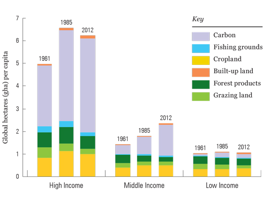
I’ll come back to the report when I’ve read it, but here’s one of those graphs. These are the differences in ecological footprints between high, middle and low income countries. As a reminder, the one planet sustainable share is 1.5 hectares per capita.

1.5 hectare per capita sounds a good quota but who will stop the age-old land grabs.