
‘Developing’ and ‘developed’ countries, ‘industrialised’ and ’emerging’ economies, ‘global north’ and ‘global south’, ‘majority’ and ‘minority world’ – there are lots of different ways of categorising the world, some of them more useful than others. One thing that they have in common is that there are only two categories. Whatever the nuances of those various terms, they basically boil down to ‘rich’ and ‘poor’.
The use of ‘middle-income’ countries notwithstanding, we seem to lack shorthand categories that reflect the reality of the world’s spread of income. We had lectures about this when I was an International Relations student, and they still haven’t really been resolved.
Hans Rosling argues that there are four categories to keep in mind. The world’s seven billion people can be mapped across four income levels:
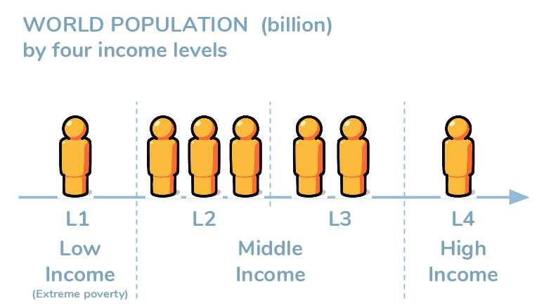
There are essentially a billion people in extreme poverty, on $1-2 a day. The next step up begins at $4 a day, and 3 billion people live at this stage. There’s no doubt that it’s a very big step up from level one, but we shouldn’t kid ourselves that people at level 2 are no longer poor.
Between $8-$32 a day we have level three, and it is here that people begin to get water on tap and stable enough electricity to run a fridge. Two billion people are at this level.
Finally, there are a billion people at stage 4, which is likely to include you and I.
With those definitions of ‘middle income’, it might seem that we’re still talking about rich and poor, but the jumps in lifestyle that happen between the levels are significant. You can explore what they mean in practice through Gapminder’s Dollar Street project.
- Graphics from Gapminder.
- More from Rosling and co in Factfulness (reviewed here) and available from Earthbound Books UK or US.

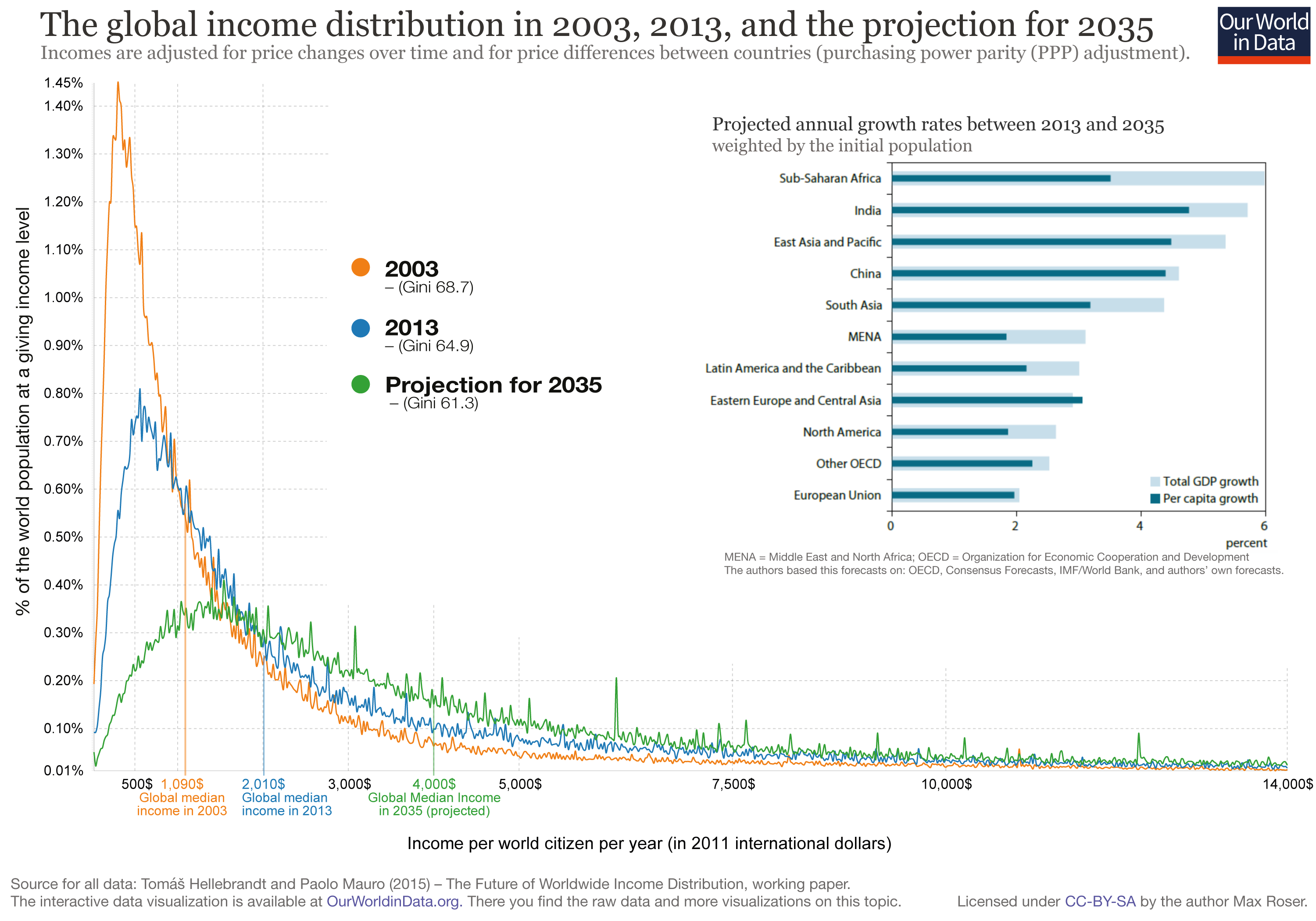
Very glad you’re featuring Gapminder’s analysis, which I very much admire. I think we need to be careful to realise that this data is presented on a logarithmic scale, which in some ways can visually mask the huge differences between highest and lowest incomes. The graph linked below shows data on a linear scale, showing that the great bulk of the world’s population are much poorer (at least in ppp income terms) than we are:
We must be careful to realise what ‘middle’ income means here – it may not be what we’d relate to as ‘middle income’ in Western Europe.
and this article is a good reminder that trying to compile income distribution data is tricky:
https://80000hours.org/2017/04/how-accurately-does-anyone-know-the-global-distribution-of-income/
Lest there be any doubt: this is not trying to nit-pick the main article – kudos for presenting this!
I wish people would stop talking about rich and poor countries. There are wealthy people in “poor” countries, and poor people in “rich” countries. People earning high wages can find them disappearing in rent, in the form of housing costs. The poverty in many of the poor countries is structural in that there are hyper-rich who are grabbing all the wealth, usually because all the land is owned by a handful of families.
Yes, those four levels do not map neatly onto countries. Lots of inequality of income within as well between countries.
The definition of middle income can easily mislead, because it doesn’t mean half of what we have. That’s why we need to keep an eye on other poverty levels besides the official extreme poverty rate.
https://makewealthhistory.org/2017/02/02/how-many-people-still-live-in-poverty/
This Gapminder chart clearly brings out the wide spread of income within every country:
https://www.gapminder.org/tools/#$chart-type=mountain