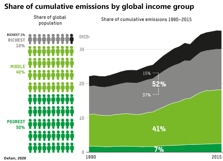
Colour versions of the images in Climate Change is Racist, and other supporting graphics.
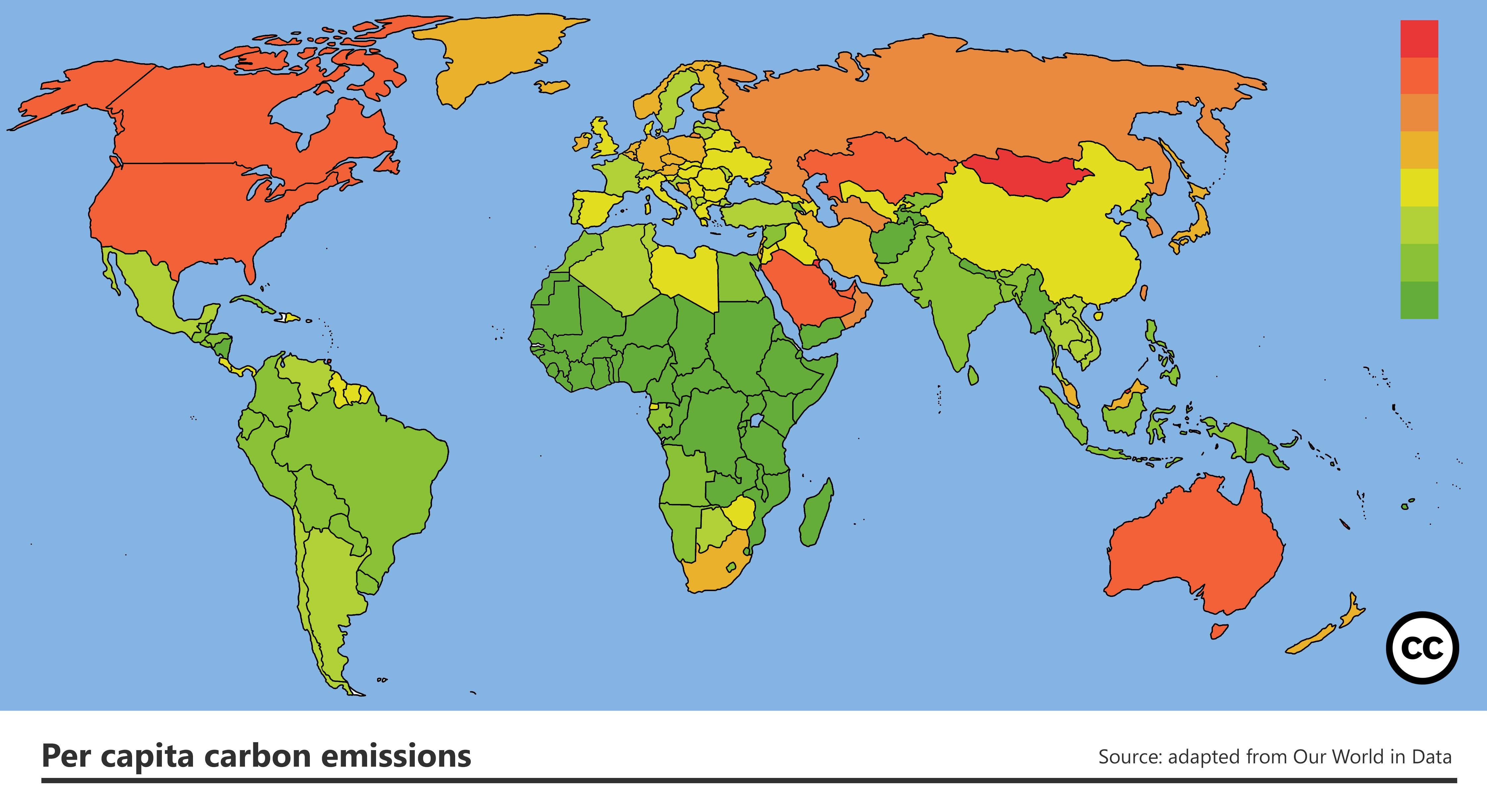
Who causes climate change

Who suffers climate change
These two maps above, in my opinion, demonstrate the problem most clearly. It was when I put the two together, in a slightly different form, that I first realised that there was a racial injustice to climate change. These two coloured versions are my own work, derived from the per capita emissions data here and the vulnerability index here. Both datasets are open source, and so are these graphics. Please use and adapt, and do let me know if you spot any errors.

Most and least vulnerable
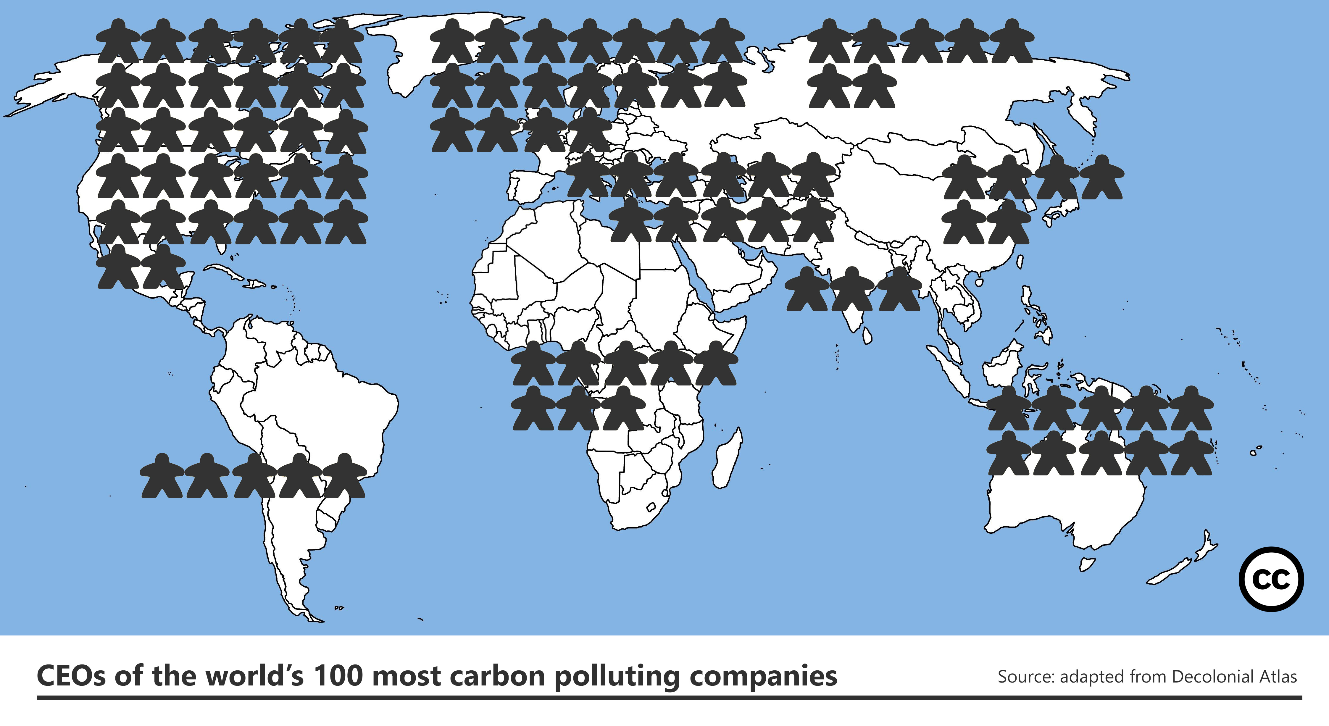
The carbon elite


Deadly heat risk